R Example
DataFest! Spring 2025
Learn how to create data science reports using R with Quarto!
Setup
You know the drill! When working with R, we need to start by loading in whatever packages are required for the work we’re doing.
In this case, we need ggplot2 for data visualization (Wickham 2016), dplyr for data transformation (Wickham et al. 2023), and WDI will be our data source (Arel-Bundock 2022).
Exercises
Now that we’ve loaded our packages, let’s run through a few progressive exercises:
- Load the data
- Transform
- Visualize as chart
- Visualize as table
Ex 1: Get data
Let’s start by using the WDI package to call the World Bank’s public World Development Indicators API. We’ll load in data for all countries for the year 2023, and we’ll use the indicator NY.GDP.PCAP.KD, which represents GDP per capita in current US dollars.
Store the output as a new data frame named wb.
wb <- WDI(
    country   = "all",
    indicator = "NY.GDP.PCAP.KD",
    start     = 2023,
    end       = 2023,
    extra     = TRUE
)
Ex 2: Transform
In this step, we will:
- Rename our GDP per capita measure to a more friendly name.
- Rank our countries by GDP per capita in descending order.
- Filter out any aggregate records.
- Filter to only the top 10 countries by their rank.
Store the output as a new data frame named wb_top10.
Ex 3: Visualize as chart
Now let’s plot the data with ggplot2! Don’t forget to add descriptive labels, and reorder your X axis so the countries are presented in descending order by their GDP per capita.
Code
wb_top10 |>
    ggplot() +
    geom_col(
        aes(
            x = reorder(country,gdp_percap),
            y = gdp_percap,
        ),
        fill = "#d42121"
    ) +
    labs(
        title = "Top 10 countries by GDP per capita",
        x     = "Country",
        y     = "GDP per capita (current US dollars)"
    ) +
    coord_flip() +
    theme_minimal()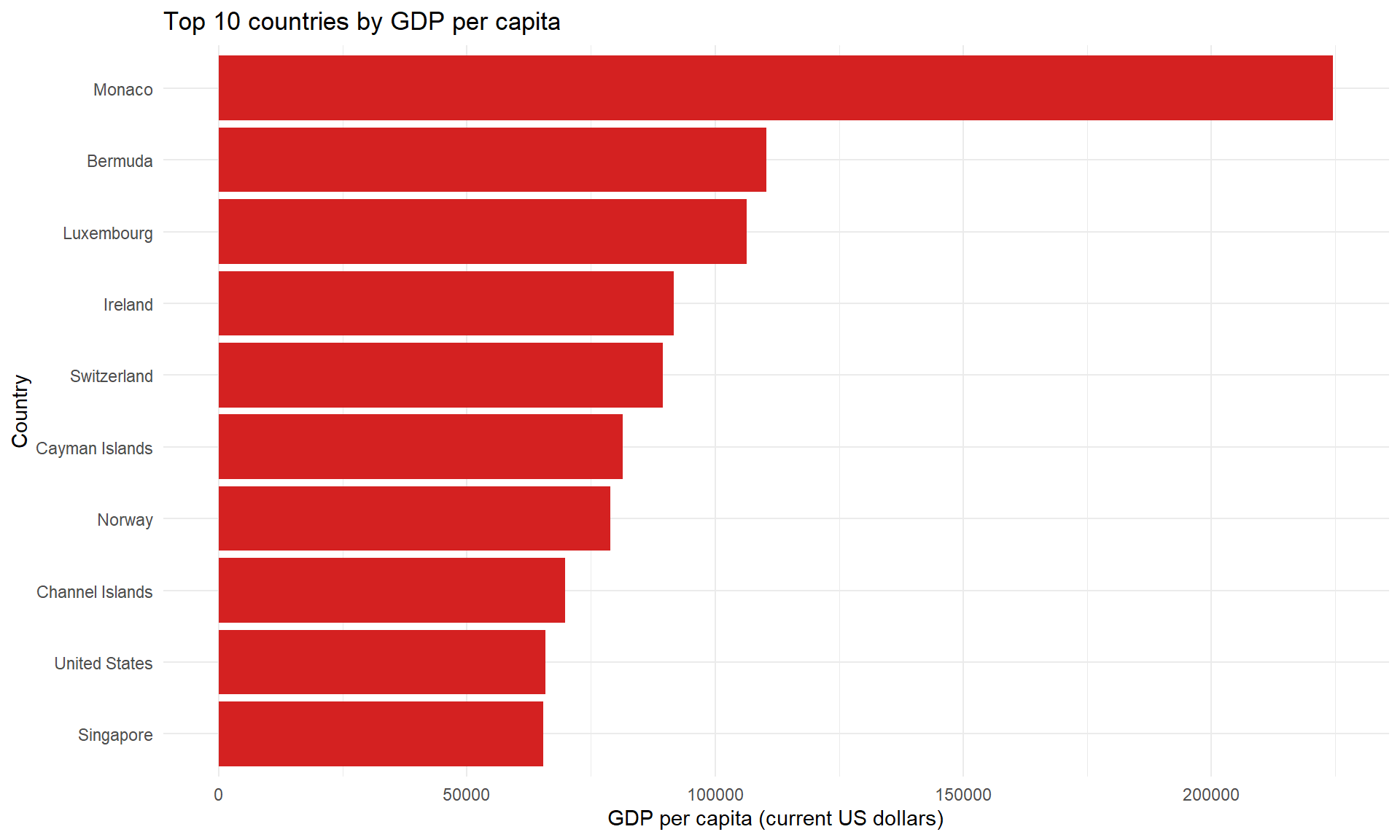
Ex 4: Visualize as table
Code
| rank | country | gdp_percap | region | income | lending |
|---|---|---|---|---|---|
| 1 | Monaco | 224582.45 | Europe & Central Asia | High income | Not classified |
| 2 | Bermuda | 110409.81 | North America | High income | Not classified |
| 3 | Luxembourg | 106342.76 | Europe & Central Asia | High income | Not classified |
| 4 | Ireland | 91647.77 | Europe & Central Asia | High income | Not classified |
| 5 | Switzerland | 89555.56 | Europe & Central Asia | High income | Not classified |
| 6 | Cayman Islands | 81411.65 | Latin America & Caribbean | High income | Not classified |
| 7 | Norway | 78912.33 | Europe & Central Asia | High income | Not classified |
| 8 | Channel Islands | 69822.95 | Europe & Central Asia | High income | Not classified |
| 9 | United States | 65875.18 | North America | High income | Not classified |
| 10 | Singapore | 65422.46 | East Asia & Pacific | High income | Not classified |